Visualising Safety, an exploration
Drawings, pictures, images, videos, movies
The issue
Literacy, media, visual and science studies, or interaction, artefact and information design have introduced and discussed the importance of drawings, images or pictures formulated in expressions such as visual literacy or visualisation in the past thirty years. It is an immense field, which embraces the myriads of ways with which we produce, use, interact, act, perform and enact through, with and across these visual artefacts whether static or dynamic, coloured or black and white, temporary or permanent, generic or specific, simple or complex, etc.

In safety research, some works have explored the importance of visualising, as, for instance, in cognitive engineering stemming from the need to design computer interfaces (e.g. Bennett, Flach, 2011), in human factors when developing a better understanding and design of safety warning signs (Laughery, Wolgater, 2014), in social, political and historical perspectives of safety posters (Menendez-Navarro, 2015, Travadel et al, 2018), in ethnographic studies based on sociomaterial sensitivities (e.g. Haavik, 2013, Tillement, Hayes, 2018), in graphic design when commenting engineering decisions that led to disasters (e.g. Tufte, 1997, 2006), but also in reflections on the graphic dimension of safety models (Swuste, 2016, Le Coze, 2013, 2019). And one could include analysis of the safety narratives purported movies (Portelli, Guarnieri, Martin, 2015, Laroche, 2016, Dixon, 2017).
However, our understanding of safety as a construct daily enacted by a multitude of artefacts, actors and institutions has never really been conceptualised from the angle of these drawings, pictures, visualisations, images, but also videos or movies. Emphasis on technical components, on actions of various individuals through cognition, organisation or regulation thanks to established disciplines such as engineering, cognitive psychology, sociology of organisation or management and political sciences have framed our grasp of safety in the past 30 years.
Little has been granted to a transversal appreciation of visual artefacts (e.g. pictures, images, videos, drawings, movies, posters) across descriptions and conceptualisations from this diversity of disciplines. Yet, in the daily practices of the high-risk industries, there is a world of images made of warning signs, diagrams (including PID: process instruments diagrams), alarms, thresholds, schematic, tables, pictograms, posters, procedures, schedules, GANTT charts, indicators, maps, logs, forms, causal diagrams but also, photographs, videos (e.g. for training) or movies etc supporting, guiding and providing contexts for the social fabric of safety (tables 1, 2, 3, 4 & 5).
 |
 |
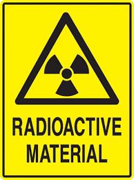 |
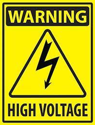
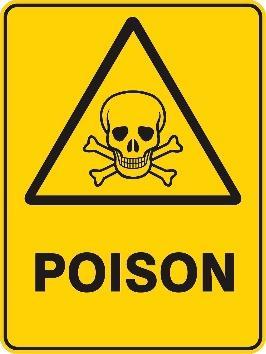
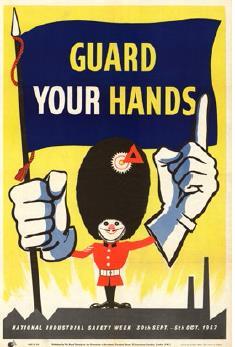
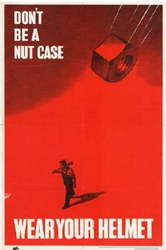
Posters and warning signs are probably the first visualisations which come to mind when thinking about safety, whether as an employee in a factory or in a high-risk system, as a user of services such as transport, as a consumer of a diversity of products or simply as a third party exposed to externalities of organisations. Design of warning signs and behavioural response to them by the diversity of audiences have been studied for many years now (Laughery, Wolgater, 2014). Interest in safety information displayed in other communicative and art form such as posters in factories have also been granted, exploring the views of workers and safety that they embody and their evolution in time as well as difference across countries (Menendez-Navarro, 2015).
 |
 |
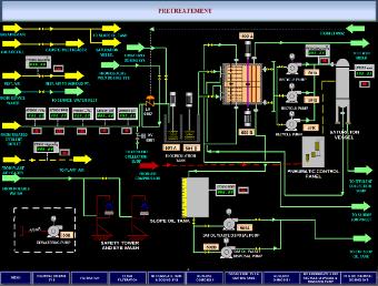
Interfaces are also quite clearly in the mind of many when it comes to visualising because of how much they frame activities of process operators in control rooms, of pilots in cockpit, of surgeons in operating theatres, etc. And, as mentioned, it has been an important research area in the field of cognitive engineering in the early 1980s onwards, with now many established writers and standards publications on the topic (e.g. Bennet, Flach, 2011).
But engineers also rely on drawings and visualisations to help decision making, e.g. when identifying hazards, assessing risks or designing processes. Analysis by Tufte of the graphics which supported the decision rationale of the Challenger launch in 1986 has become a landmark study of this aspect of engineering decision making (Tufte, 1997). By omitting to exhibit in an appropriate manner data which were available and that they knew to be important to ground their rationale, engineers failed to provide a more complete view of the relationship between temperatures and Orings’ problems. “The chart makers had reached the right conclusion. They had the correct theory and they were thinking causally, but they were not displaying causally” (Tufte, 1997, p. 44). Viewing data differently could have made a difference in the decision-making process.
 |
 |
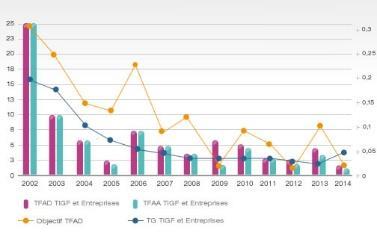 |
Operators and engineers are of course not the only users of graphics. Managers also rely on them. The most evident example in the field of safety are the trends based on indicators which are built and followed to steer organisations’ degree of achievement in preventing health, occupational or process events. The widespread use of ratios in occupational safety calculating the number of days off for injured people for 1000 hours worked (at the level of a plant or an entire corporation), but also number and magnitude of incidents which are considered important to follow, are transformed into graphics. The validity of these indicators as safety measures has been questioned by safety science, but their use in industry is still widespread. This is probably at least in part due to their easy visualisation and the apparent easiness of interpreting the visual (line goes up is bad and corrective actions are needed, whereas when line goes down the direction is right).
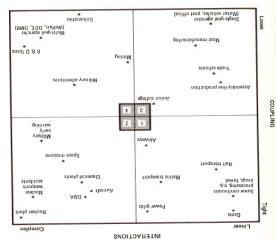
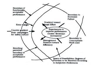
Safety researchers are also great producers and users of drawings, pictures and visualisations for conceptualising the phenomena they attempt to grasp. Examples abound of drawings supporting the framing of scientific areas of investigation: human error, sociotechnical systems, comparing high-risk systems or accident causation have all been assisted by pictures, drawings or images other than texts (Le Coze, 2019). They are designed by various authors and circulate among peers, sometimes bridging research and practice, and shaping the field through their heuristic visual properties. This drawing creativity is quite widespread among safety professionals too who are not only consumers but also designers and producers of their own drawings, pictures and visualisations that they regularly use in practice.
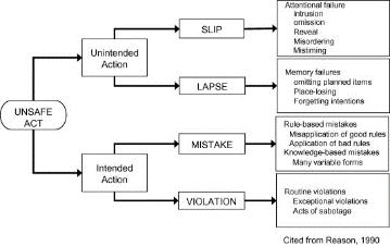
Some visualisations in safety science have also remained in use despite a lot of scientific evidence against the theoretical models underlying the visualisation. Examples of these are the domino-model of accident causation, accident-incident triangle or the Swiss Cheese accident model. Again, their visual properties make them attractive to a general audience. Sometimes, the attractiveness of the visualisation may be more important factor explaining the diffusion of the model than its underlying logic with regards to the phenomena depicted.
 |
 |
 |
This very short description of the world of pictures, drawings and visualisation does not exhaust the diversity of other image based artefacts, such as photographs, Powerpoint, cartoons, videos, TV programs or movies which also offer some support for descriptions, interpretations, narratives and understandings of safety for a wider audience than the people populating workplace, factories, high-risk systems or the users of services (e.g. transport).
For instance, recent movies which come to mind are blockbusters such as Sully or DeepWater Horizon, and there are popular programs about aircraft crashes, or other disasters quite regularly broadcasted on TV, such as, in French, La minute de vérité (the minute of truth), which are extremely useful in human factors or sociology of safety training courses. Moreover, in the context of our increasingly digital world, safety movies available on YouTube or DailyMotion, whether from practitioners or academics (e.g. conference, courses), are also now a widespread phenomenon, which provide support for the visual diffusion of safety research, practices and ideas.
How to think about these visual artefacts? A lot has been described about rules and procedures which embrace the more traditional literacy aspect of our human condition than the now visual literacy which expands with digitalisation. The aim of this workshop is to explore this realm of visualisations, images, drawings, pictures, photographs and videos in the field of safety. It wishes to build a better appreciation of how these diverse artefacts contribute in their own specific way to the social fabric of reliability, safety or resilience. It is an exploratory workshop, aware of the limited number of studies available in safety on this topic, but willing to open many different lines of investigation, a workshop therefore multidisciplinary in its prospect. It wishes to increase our awareness of the incredible complexity of the current sociomaterial dynamics of our mediatised, digital and globalised world. “Like it or not, the emerging global society is visual” (Mirzoeff, 2016, p. 4).
Questions
The following non-exhaustive list of questions can be explored:
-
Which are the examples of successful visualisations in safety, in research, in practice? Do we know why?
-
How do safety pictures, signs, drawings, visualisations or videos in safety have evolved over time? Can we characterise this evolution?
-
How to classify the diversity of visual artefacts in safety? In relation to what properties? From simplicity to complexity? From dynamic to static? To what features?
-
What is your experience as a researcher of drawings, pictures or videos? How important are they to your research process, from theorising to communicating? Are visualisations only appropriate to communicate about safety, or also to conceptualise safety?
-
How do pictures, drawings or videos contribute to the enactment of safety? What do we know about the effects/influence of visualisation on safety (structures, processes, outcome)? What kind of agency do pictures, drawings or visualisations have in safety? How performative are they? How can we, describe conceptualise or even measure this performativity?
-
How do practitioners and/or researchers produce, use and diffuse diverse visualisations in their daily activity? How important it is to their coordination, cooperation or communication?
-
How does visualising a concept change the concept? Do visualisations complement, accompany or replace texts? Are safety models and theories best conveyed by drawings than texts?
-
How do research drawings, pictures or videos contribute to our framing of safety as a scientific object?
-
How do videos or movies portray safety through their narratives? Can they be useful support for safety management, for public awareness or dread? How?
-
What kind of opportunities new technology offers in the context of safety knowledge production, transmission and use?
-
How does big data shape new need for visualisations in the field of safety? Can the tools and methodologies develop in the context of big data transferred in a safety context?
-
What are the limits of visualising? Are there some phenomena that cannot or should not be visualised? Are there dangers in visualising complex phenomena such as safety? How do you visualise risk and uncertainty? How do visualisations guide the attention of public and experts on risks and safety? Can a vivid visualisation create biases (e.g. availability bias) that distract attention from other, less visualised, risks or types of safety?
References
Dixon, S., Gawley, T. 2017. Crude exploration. Portraying Industrial Disaster in Deepwater Horizon, a film directed by Peter Berg, 2016. In New Solutions: a Journal of Environmental, Occupational Health Policy.
Haavik, T. 2017. Remoteness and sensework in harsh environments. Safety Science, 95, 150-158
Laughery, K, R., Wolgater, M, S. 2014. A three-stage model summarizes product warning and environmental sign research. Safety Science, 61, 3-10.
Le Coze, JC. forthcoming. Visualising safety, in Le Coze, JC (ed). Forthcoming. Safety Research: evolutions, challenges and new directions. Taylor and Francis.
Le Coze, JC. 2016. Trente ans d’accidents, le nouveau visage des risques sociotechnologiques. Toulouse, Octarès.
Le Coze, JC. 2013. New models for new times. An anti-dualist move. Safety Science. 59. 200-218.
Laroche, H. 2016. De “Sully” à Trump: la légende de l’individu contre l’organisation. The conversation. 9 décembre 2016.
Mirzoeff, N. 2016. How to see the world. An introduction to images, from self-portaits to selfies, maps and movies, and more. London, Basic Books.
Portelli, A., Guanieri, F., Martin, C. 2014. Le nucléaire fait son cinéma. Revue Générale du Nucléaire. 1. 96-101.
Tillement, S., Hayes, J. 2018. Maintenance schedules as boundary objects for improved organizational reliability. Cognition, Technology and Work.
Travadel, S, Portelli, A, Parizel, C., Guarnieri, F. 2017. Les figures de l’infime, la radioprotection en images. Techniques & Culture. 2. 68. 110-129.
Tufte, E. R. 1997. Visual explanations. Images and quantities, evidence and narratives. Cheshire, CT, Graphics Press..
Tufte, E. R. 2006 Beautiful Evidence, Cheshire, CT, Graphics Press.
Swuste, P. 2016. Is big data risk assessment a novelty? Safety and Reliability. 3. 134-152.
Workshop conveners
- Jean-Christophe Le Coze, Ineris
- Teemu Reiman, Fennovoima
Outputs
The position papers presented during the workshop were improved by authors based on discussion at Royaumont, then published as an open access volume in the SpringerBriefs in Safety Management series. The book can be downloaded for free in PDF and ePub formats.
| Title | Visualising Safety, an Exploration: Drawings, Pictures, Images, Videos and Movies |
| Editors | Jean-Christophe Le Coze, Teemu Reiman |
| Publisher | Springer |
| Year | 2023 |
| ISBN | 978-3031337864 |